
INFOGRAPHICS
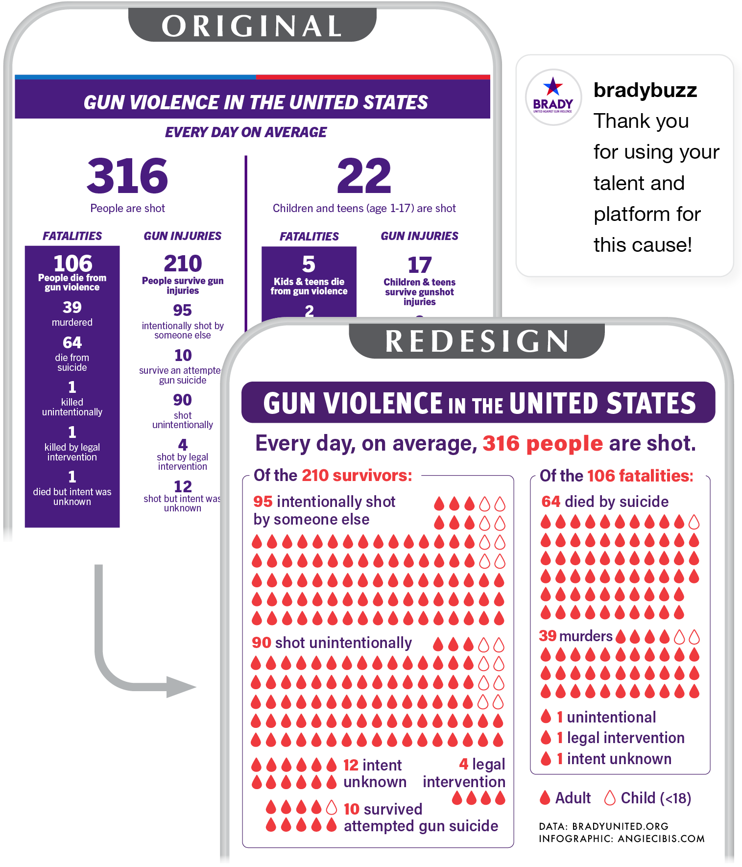
By refining hierarchy, visual density, and layout, I created a clearer visual narrative for Brady United that conveys scale and context at a glance while preserving the seriousness of the data.
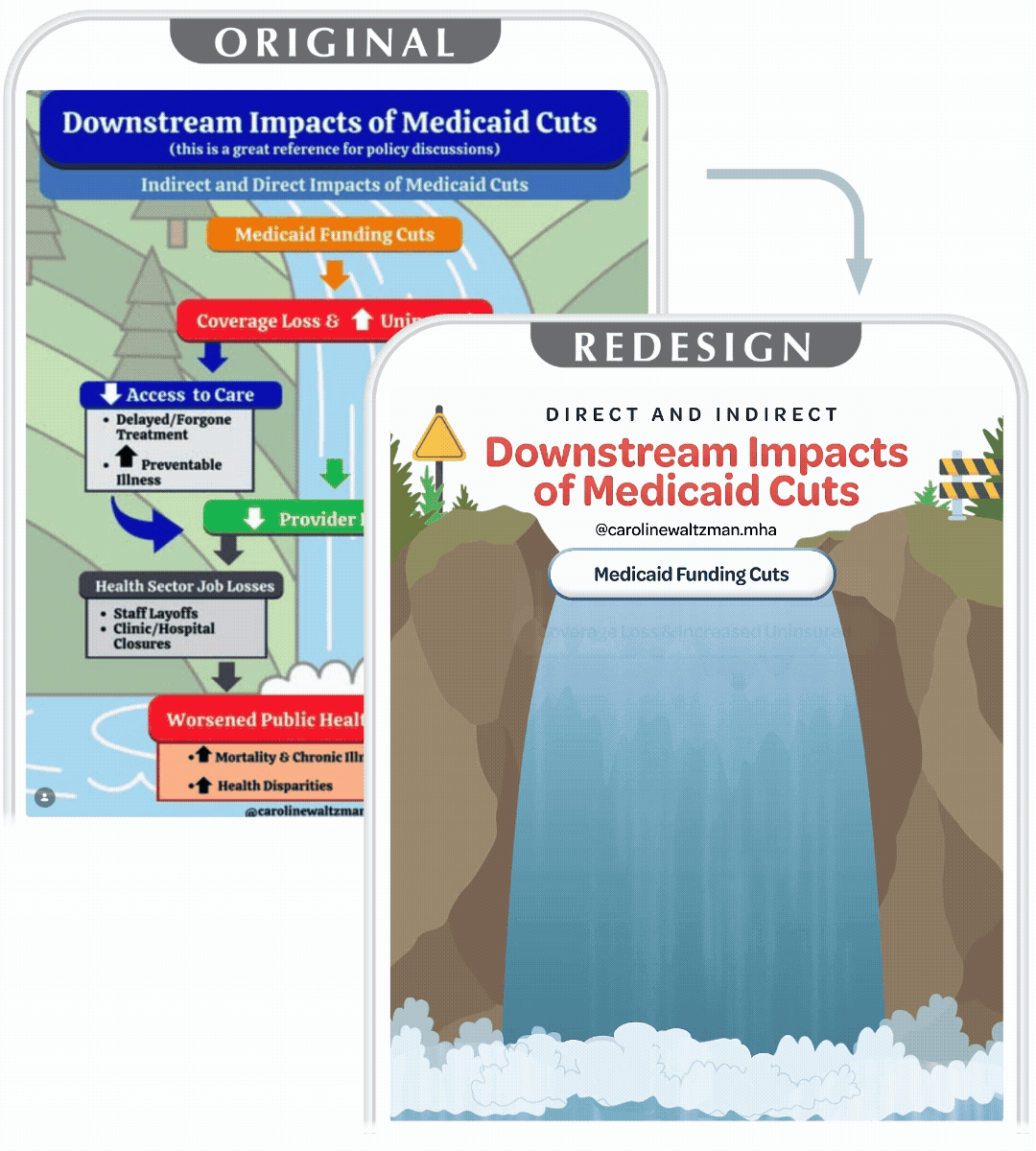
I transformed Caroline Waltzman’s Medicare infographic into a streamlined, animated visual that makes complex cause-and-effect relationships immediately legible at a glance.

I created this infographic for writer and trauma-informed somatic coach Nisha Mody to illustrate the structure and interrelatedness of trauma-informed communication.

My redesigned Polyvagal Chart has been purchased internationally as a poster by both mental health professionals and general audiences across Ireland, Australia, England, Israel, Germany, Canada, and the United States via Redbubble.